A bakery based in the Hudson Valley. Kerri is an at home baker with a culinary background.
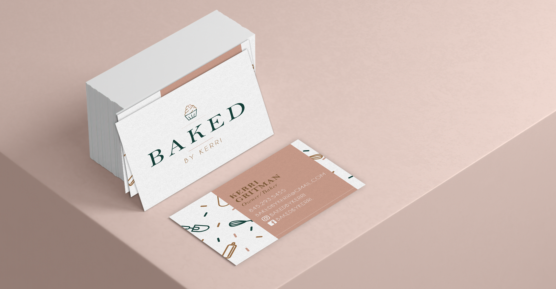
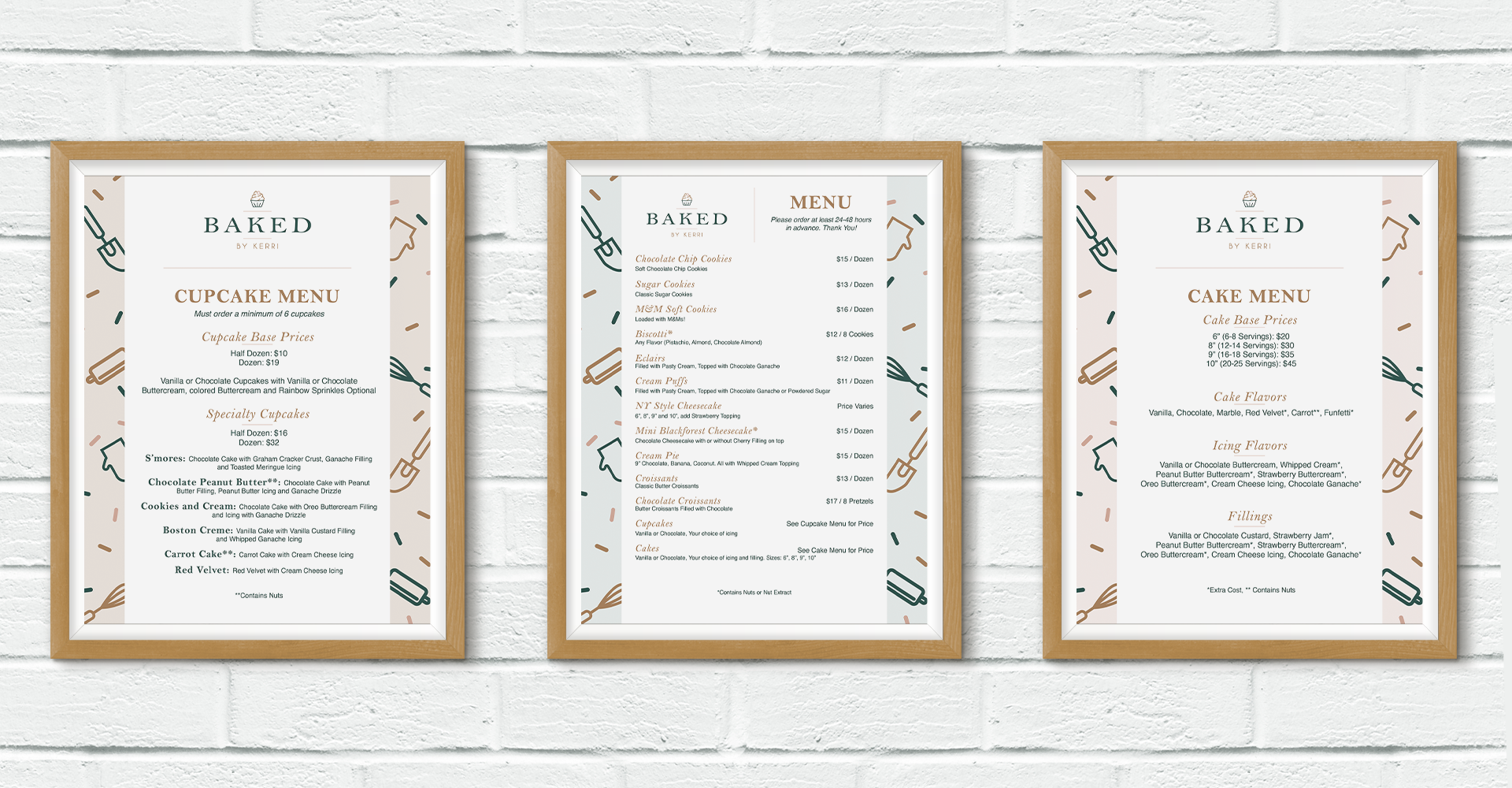
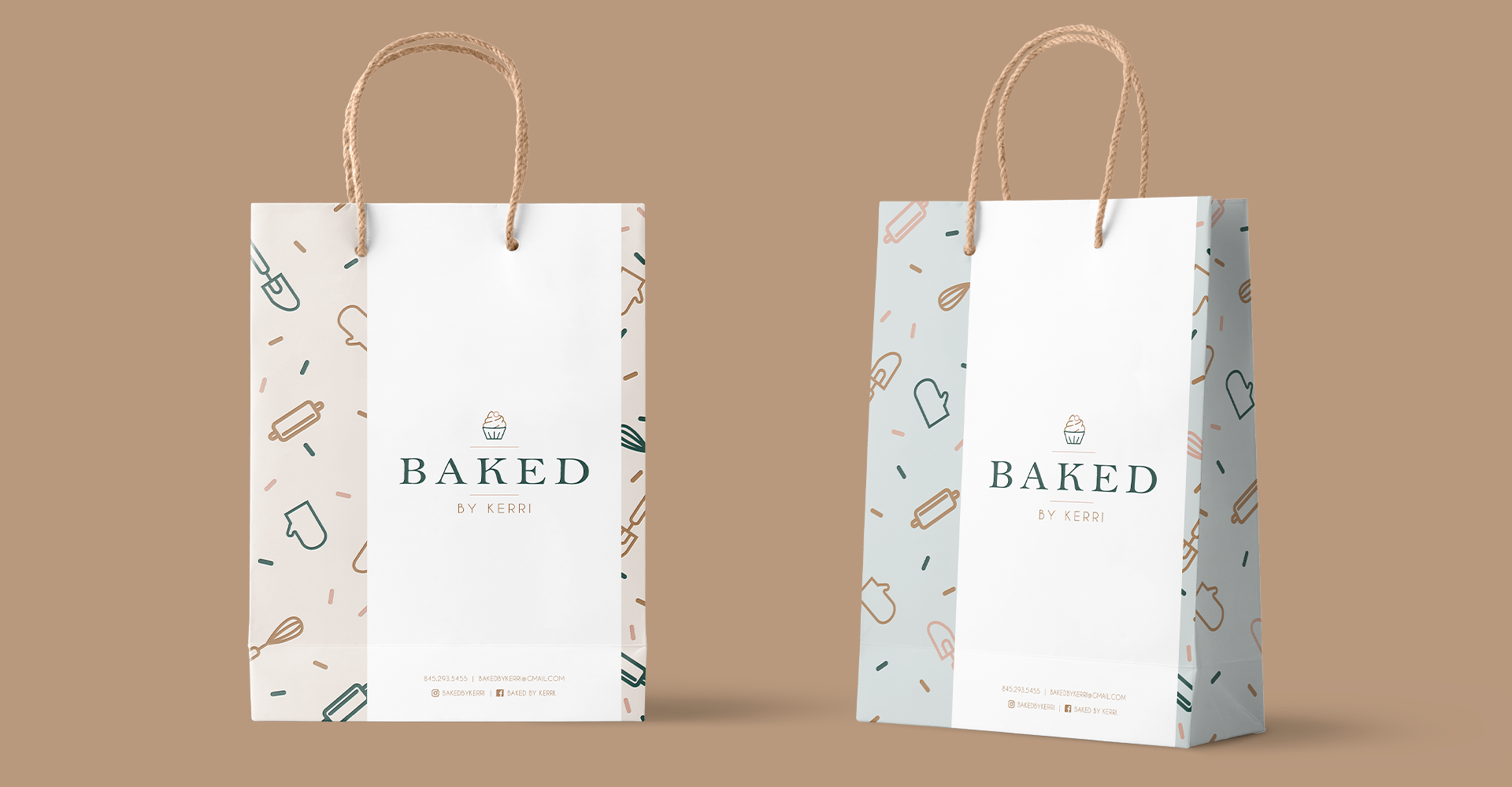
The challenge was to create a logotype and brand identity that will be attractive and recognizable for her target audience. She wanted a modern design that could use icons symbols to create a pattern that would be fun and inviting. By straying from the cliche bakery colors and introducing a beautiful dark green and light mauve pink in the branding and packaging, will help her be instantly recognizable and stand out. With a versatile visual identity can help her feel confident in branching out and reaching her goals.

